Related articles:
Library & Inbox, Posts, Cards, UGC popup, Labels
How galleries work
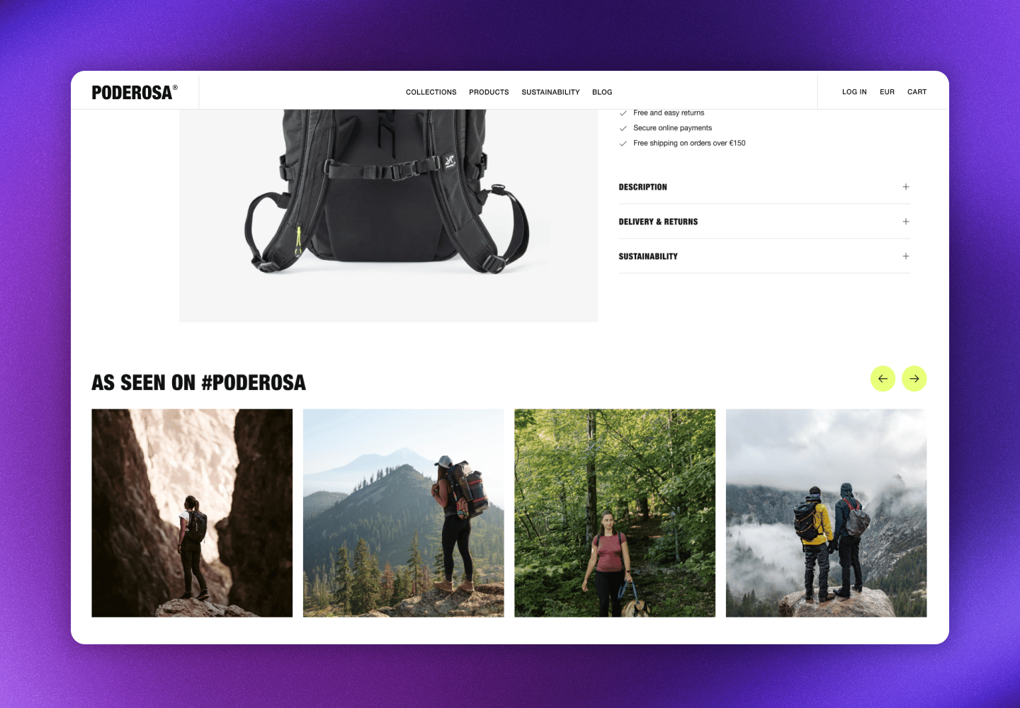
Galleries dynamically display content based on your content source settings. When a visitor clicks one of the posts, a popup opens the post in full size and shows additional information and product tags. Customize what’s included in the UGC popup. Key features:- Automatic updates: Galleries refresh with new approved content that matches their filters
- Shoppable experience: Product tags link directly to your product pages
- Easy to design: Layout and design can be adjusted for each gallery
- Localized: Adjusts language, links, currency, and prices based on the market
- Responsive design: Adapts to different screen sizes and devices
- Performance optimized: Images are lazy-loaded and cached for fast loading
Available galleries
Cevoid provides several pre-configured gallery types to cover common use cases. Each gallery type is designed for a specific purpose, making it easy to get started. You can also create custom galleries when you need more control over what content is displayed.Product dynamic galleries
Product dynamic galleries automatically change their content based on the ecommerce page they’re displayed on. This is powered by product tags and the product information from your product catalog. This allows you to use one gallery across all product pages, one across all collection pages, and one across all category pages. This minimizes the work needed to populate your ecommerce pages with relevant and inspiring content. The real time-saver: a single product tag added to a post makes that post available across all three gallery types. It can appear on the product page, the collection page, and the category page where that product belongs.Product page gallery
The product page gallery shows posts featuring the product the visitor is viewing. It uses Cevoid’s fallback AI to make sure there’s always something to show, even for products with limited UGC. How content is prioritized:- Posts tagged with the exact product variant the visitor is viewing
- Posts tagged with other variants that share attributes (like color or size)
- Posts tagged with the primary product or any variant of the same product
- Posts featuring similar products based on Cevoid’s AI (optional)
Fallback settings are managed under Design -> Fallback on your product page gallery.
If no posts match any of these criteria and fallback is disabled, the gallery will be hidden on that product page.
Collection page gallery
The collection page gallery automatically displays posts featuring products from the collection the gallery is loaded on. When a visitor browses your “Summer Collection” page, they’ll see UGC featuring products from that collection. The gallery detects which collection page it’s on and fetches relevant content automatically.Category page gallery
The category page gallery is designed for hierarchical category structures. It shows posts featuring products in the category the gallery is loaded on and all its subcategories, giving visitors a broader view of content across related products.Social feed galleries
Social feed galleries display content from your brand’s connected social media accounts. These are perfect for showcasing your brand’s own Instagram aesthetic or TikTok presence on your website.General galleries
General galleries display all of your posts or all of your UGC posts.Custom galleries
Custom galleries let you build galleries for specific pages and sections. Choose from multiple content sources and combine them to create galleries for specific campaigns, pages, or purposes.Create a custom gallery
- Navigate to UGC -> On-site widgets
- Click New widget
- Select Custom gallery
- Click the Content tab
- Click Add content
- Select your content sources: you can combine multiple sources
- Optional: Click More and rename your gallery
- Click Save changes
Design and customize galleries
Every gallery can be customized to match your brand and website. Choose from different layouts, adjust how posts are displayed, and add features like filters and upload buttons.Styling changes apply on the next page view after clicking Save changes.
- Navigate to UGC -> On-site widgets
- Select your gallery
- Click the Design tab
- Apply your changes
- Click Save changes
Gallery layouts
Choose how your posts are arranged. Each layout offers different settings to control the number of posts shown, how they’re organized, and how visitors load more content.Grid layout
Posts display in a clean, uniform grid. This is the most common layout and works well for most use cases.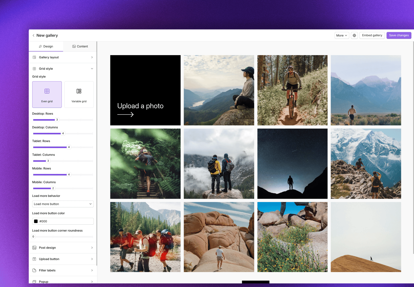
Slider layout
Posts display in a horizontal carousel that visitors can scroll through. Great for compact spaces or when you want to encourage browsing.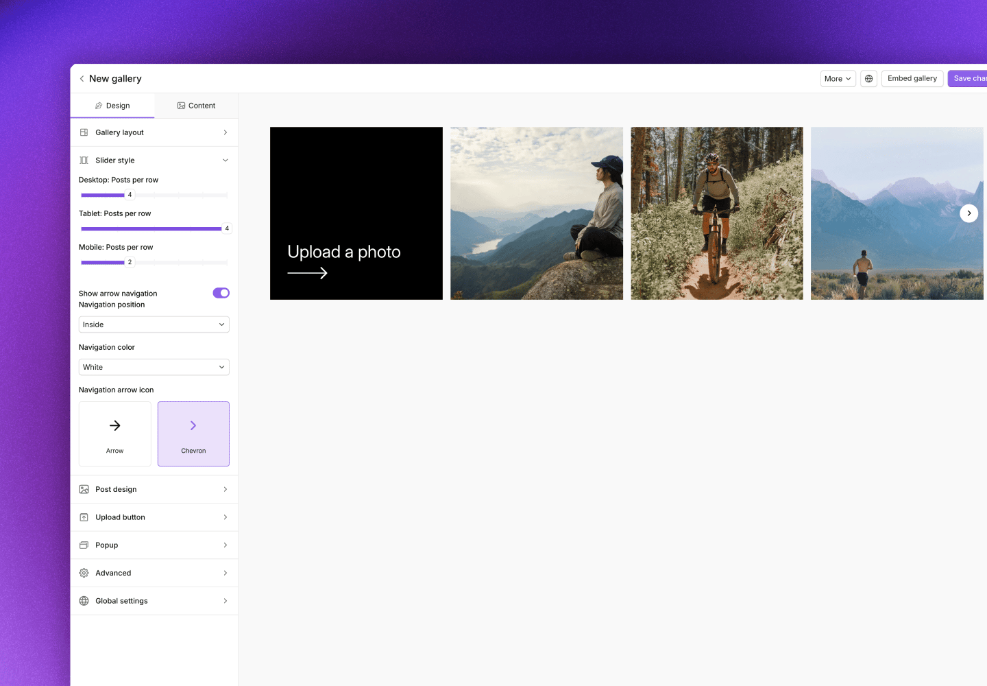
Masonry layout
Posts display in a Pinterest-style layout where images maintain their original aspect ratios. This creates a more dynamic, editorial feel.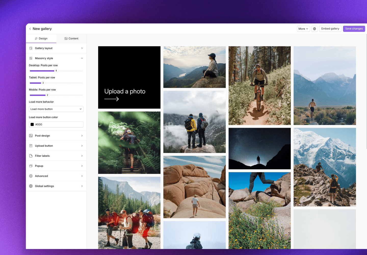
Collage layout
Posts display in a fixed artistic arrangement. Perfect for hero sections or when you want a more curated, designed look.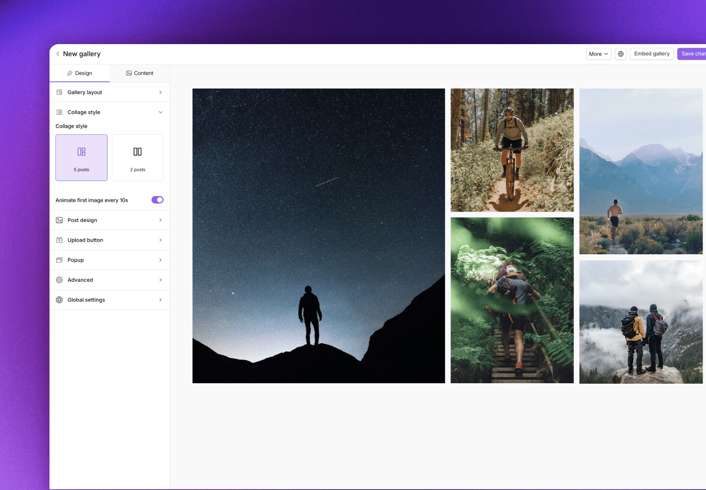
Post styles
Control how individual posts look within the gallery. Each style emphasizes different information and creates a different feel.Tags style
Shows product tag hotspots directly on the posts, making it immediately clear that products are shoppable. Visitors can see exactly where to click.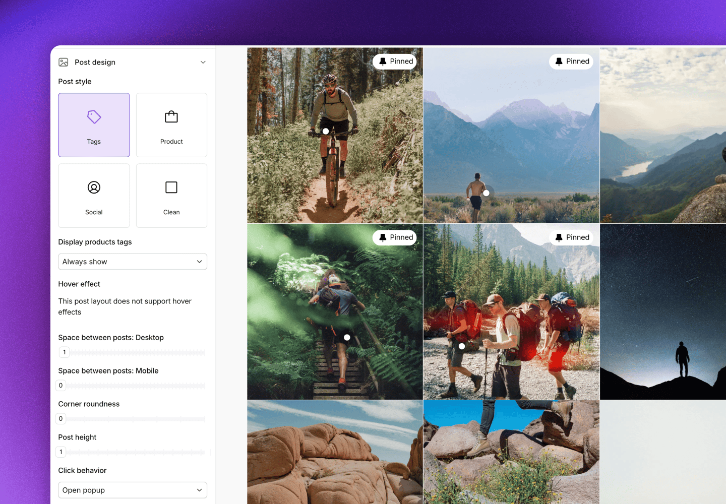
Product style
Displays product information (name, price) below each post. This style is great when you want to emphasize the shopping aspect and show visitors what products are featured.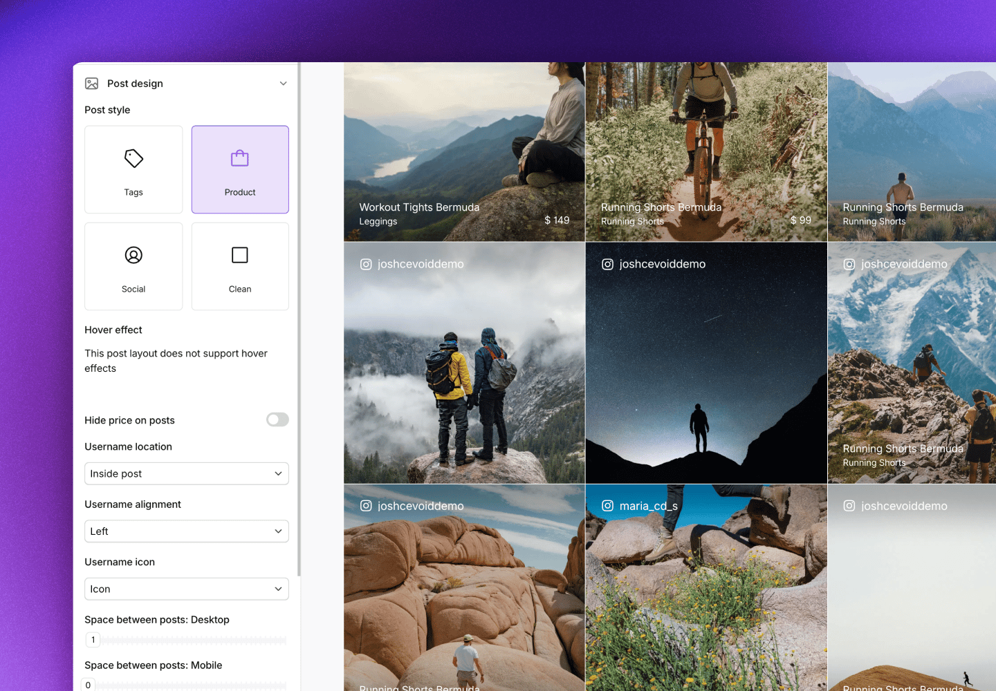
Social style
Gives posts a social media feel by showing the creator’s name or handle. Perfect for highlighting the community aspect and giving credit to your customers.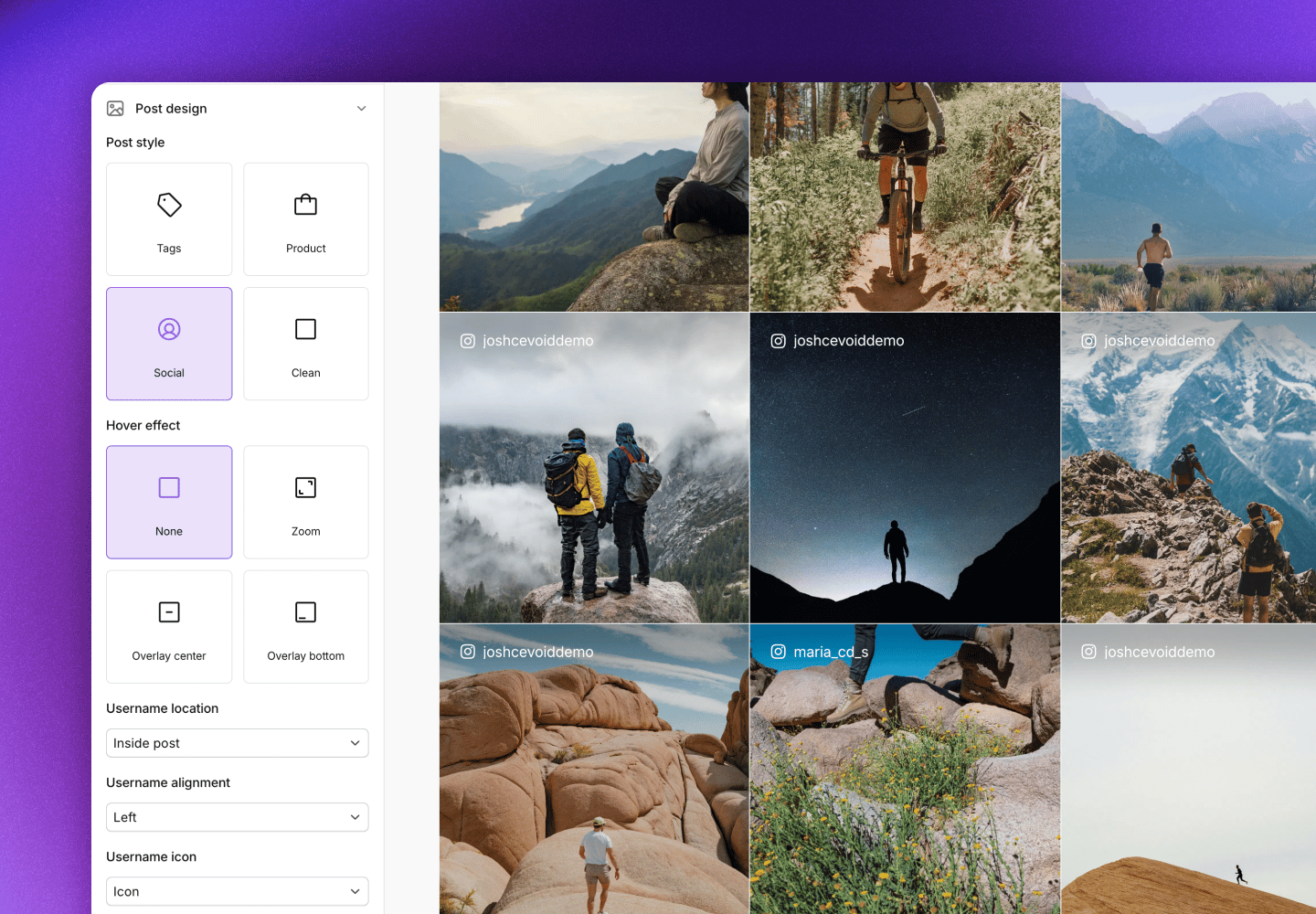
Clean style
A minimal look that lets the content speak for itself. No overlays or information by default: just the images and videos.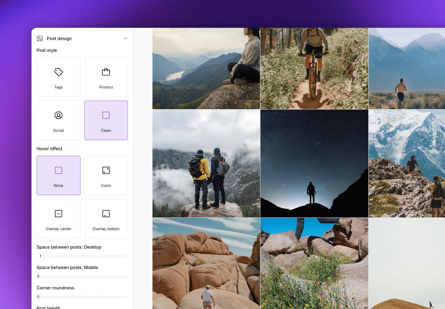
Upload button
Add an upload button to your gallery so visitors can submit their own content directly from your website. When clicked, it opens a popup version of one of your upload forms.Content submitted through the upload button goes to your Inbox for approval before appearing in any galleries.
- Navigate to UGC -> On-site widgets and select the gallery
- Click Design -> Upload button
- Set Visible to Yes
Filter labels
Let visitors filter the gallery by topic using clickable filter buttons. Filters are based on post labels. Create labels for topics relevant to your customers and apply them to posts, then enable those labels as filters in the gallery.- Navigate to UGC -> On-site widgets and select the gallery
- Click Design -> Filter labels
- Toggle on Show filter labels
- Select which labels should appear as filters
- Optional: Enable Show “All” button so visitors can see all posts again after filtering
Advanced settings
Global settings
These settings apply to all galleries and cards.Exclude posts from a gallery
Sometimes you want certain posts to appear in some galleries but not others. You can use post labels to control this. Create a label like “Exclude from homepage” or “Exclude from PDPs” and apply it to any posts you want to hide from specific galleries. Then tell the gallery to exclude posts with that label.- Navigate to UGC -> On-site widgets and select the gallery
- Click the Content tab
- Click Exclude labels
- Select the label(s) containing posts you want to exclude
- Click Save changes
Pin posts to the top
By default, galleries show your newest posts first. But sometimes you have standout content that you want to feature at the top, regardless of when it was posted. Pinning lets you lock specific posts to the beginning of the gallery.- Navigate to UGC -> On-site widgets and select the gallery
- Click the Content tab
- Hover on a post in the preview or content list
- Click the pin icon
- Click Save changes
Pinned posts stay at the top even as new content is added to the gallery. New posts will appear after your pinned content.
Embed galleries on your website
Once your gallery is designed and configured, adding it to your website is straightforward. The method depends on your platform.- Shopify
- General implementation
- CMS block
If you’re using Cevoid’s UGC Shopify app, you can add galleries using prebuilt theme sections: no code required.
Have a headless Shopify setup? Use the general implementation instructions instead.
- Navigate to UGC -> On-site widgets and select your gallery
- Click Embed gallery
- Copy the Gallery ID
- Open your Shopify theme editor
- Navigate to the page where you want the gallery
- Add the appropriate Cevoid section:
- Cevoid gallery: for standard galleries on any page
- Product page gallery: for product pages (automatically shows content relevant to each product)
- Collection page gallery: for collection pages (automatically shows content relevant to each collection)
- Paste the Gallery ID
- Adjust section settings as needed
- Click Save