Available widgets and sections
Each section of your rewards program is available as a standalone widget you can embed individually. There is also a Full landing page widget that combines all sections into one embed for a complete rewards page. We recommend highlighting your program in at least these two places: A dedicated rewards landing page where visitors can learn about your program, participate in activities, and manage their rewards. Use the Full landing page widget for a complete, ready-to-embed solution, or combine standalone sections for more control over layout and placement. Your customer account page where logged-in members see their membership status. At minimum, include widgets showing their membership details and available rewards. You can expand this with activities, tier progress, or the points shop depending on your preferences. The widget editor shows a live preview of your changes as you make them. Switch between desktop, tablet, and mobile views to check the layout before publishing. Sections that require login, such as My account and My rewards, are collapsed and hidden for visitors who aren’t logged in as a member. Sections that have both a logged out and signed in state, like Hero, Activities, and Tier cards, let you toggle between both views in the preview.Hero
The Hero section is a full-width banner that introduces your program. It’s typically the first thing visitors see on your rewards landing page, setting the tone for your program and encouraging sign-ups. The section displays your program title and description over a customizable background image, with prominent Join Now and Sign In buttons for visitors. When a member is logged in, the buttons are hidden since they’re already part of the program.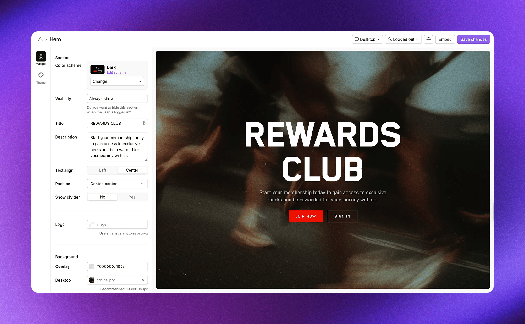
Example from our demo store. Customize the look in your design theme.
About
The About section explains how your program works using a multi-column layout. Each column walks visitors through a step of your program, typically covering how to join, earn points, level up through tiers, and redeem rewards. This section helps set expectations for new visitors and gives them a clear understanding of what they’ll get by joining. The columns are fully customizable, so you can adapt the messaging to match your program’s unique structure.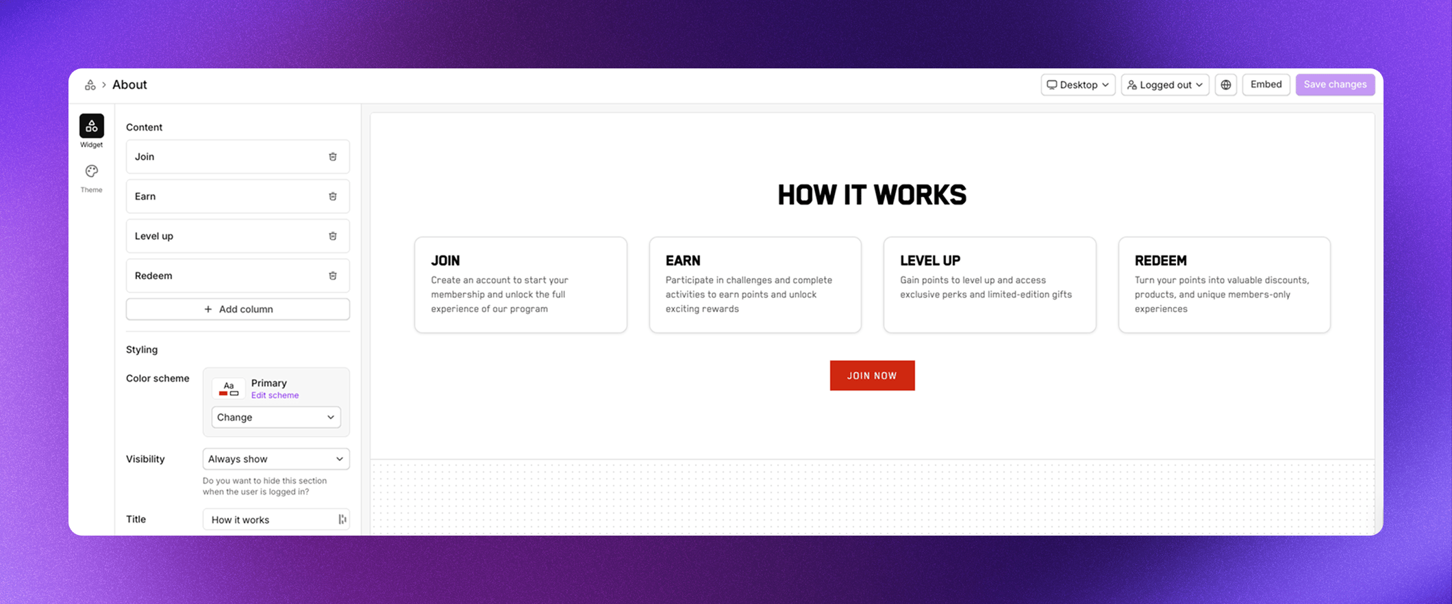
Example from our demo store. Customize the look in your design theme.
- Click Add column to create a new step
- Drag columns to reorder them
- Click a column to edit its icon, title, and description
Account summary
The Account summary section gives logged-in members a complete overview of their membership in three summary cards. It combines membership status, their rewards, and points history into one compact view. The first card shows their tier status, including your program name, their current tier, member name, progress bars for each milestone, and join date. The second card displays their available rewards with a list they can browse, plus a button to see all rewards. The third card shows their points balance and recent points history, with buttons to redeem rewards or view full history. This section is only visible when a member is logged in.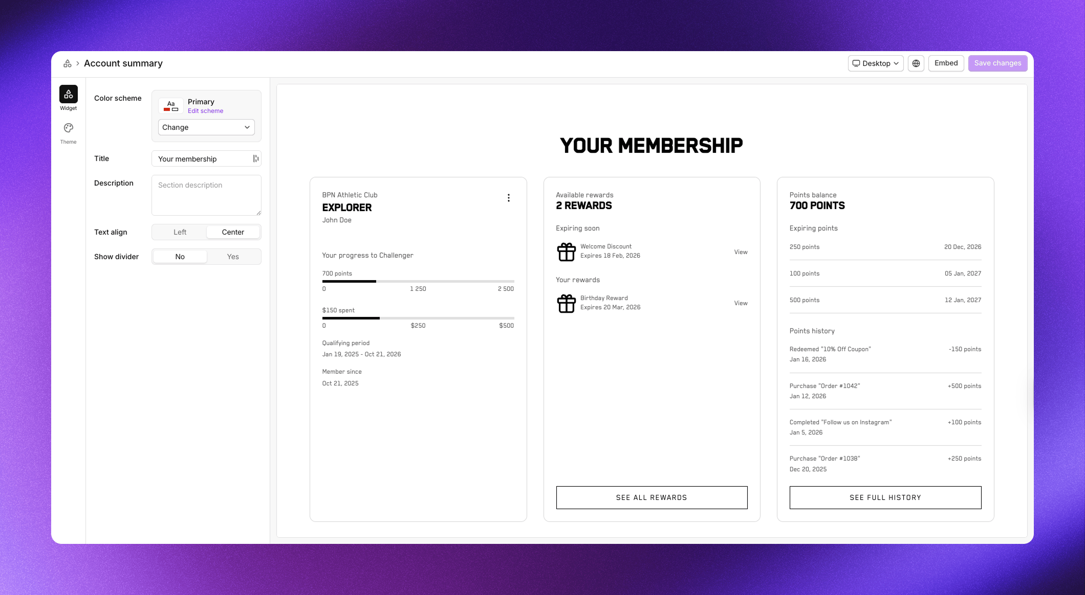
Example from our demo store. Customize the look in your design theme.
My account
The My account section shows the member’s current tier status and progress toward the next tier. It displays the program name, their tier, name, progress bars for each milestone used in your program, and when they joined. Use this section when you want a focused view of membership status without the rewards and points history included in Account summary. It works well on customer account pages where space is limited. This section is only visible when a member is logged in.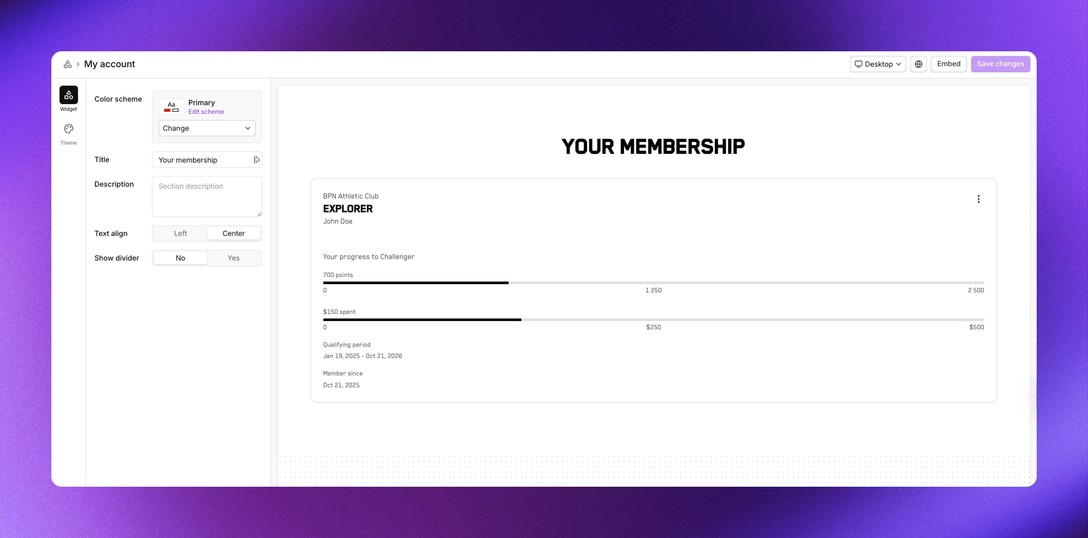
Example from our demo store. Customize the look in your design theme.
Tier progress
The Tier progress section shows the member’s journey through all tiers in a horizontal progress layout. It displays progress bars for each milestone used in your program, highlights the member’s current tier, and shows each tier with its rewards and perks listed below. Unlike Tier cards which shows tiers in a grid, Tier progress emphasizes the progression from one tier to the next. Members can see exactly how far they are from the next level and preview the rewards waiting for them. This section is only visible when a member is logged in.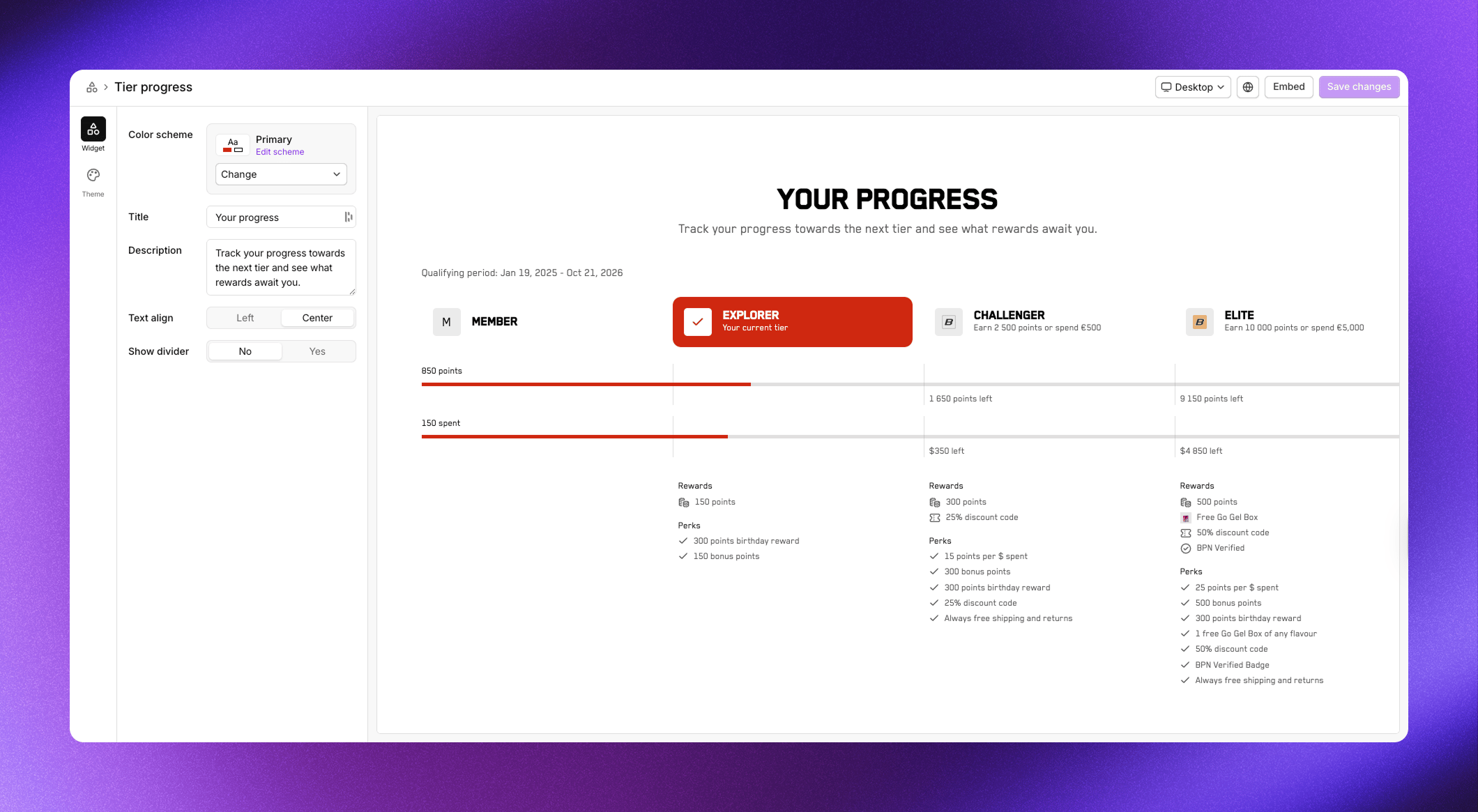
Example from our demo store. Customize the look in your design theme.
My rewards
The My rewards section displays all rewards the member has received in a grid layout. Each reward card shows the reward name, icon, and when it was received. Members can click on rewards to view details or copy discount codes. Use this section to give members easy access to their earned rewards. It’s particularly useful on customer account pages where members want to quickly find and use their discount codes. This section is only visible when a member is logged in.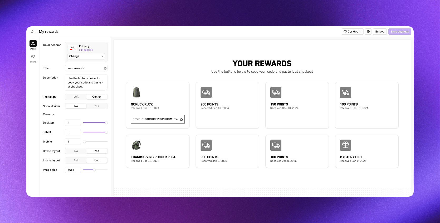
Example from our demo store. Customize the look in your design theme.
Purchase incentives
The Purchase incentives section shows visitors how they can earn points on purchases. It displays your points-per-currency-spent rate prominently, encouraging visitors to sign in and start earning.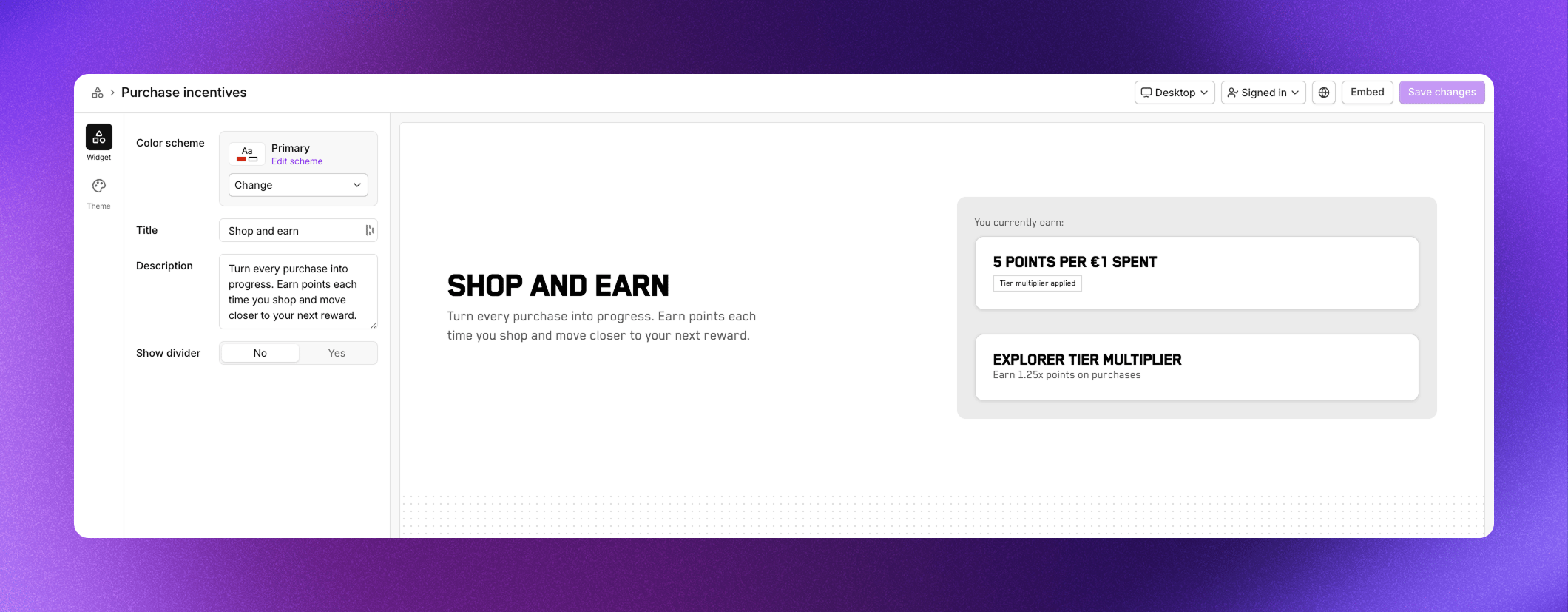
Example from our demo store. Customize the look in your design theme.
Activities
The Activities section displays your single-task activities and challenges in a grid. Members can browse available activities, see the points or rewards they’ll earn, and click to participate. Each activity card shows the activity icon, title, and reward. Challenges display additional information like end dates and descriptions. When members complete activities, those move based on your sorting settings so active opportunities stay prominent.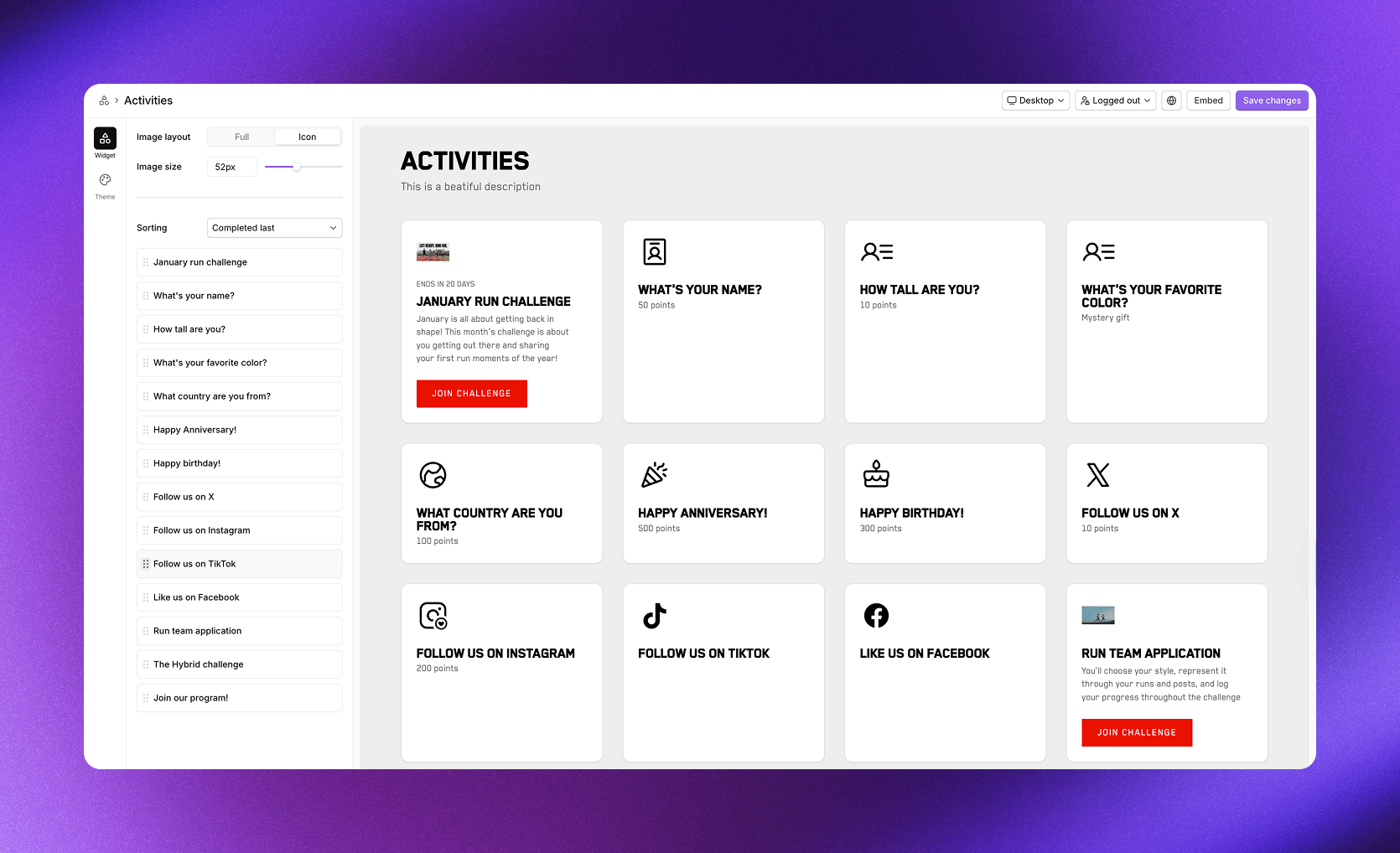
Example from our demo store. Customize the look in your design theme.
Redeemable rewards
The Redeemable rewards section shows your points shop, where members can browse and redeem rewards using their points. Each reward card displays the reward name, icon, and points cost.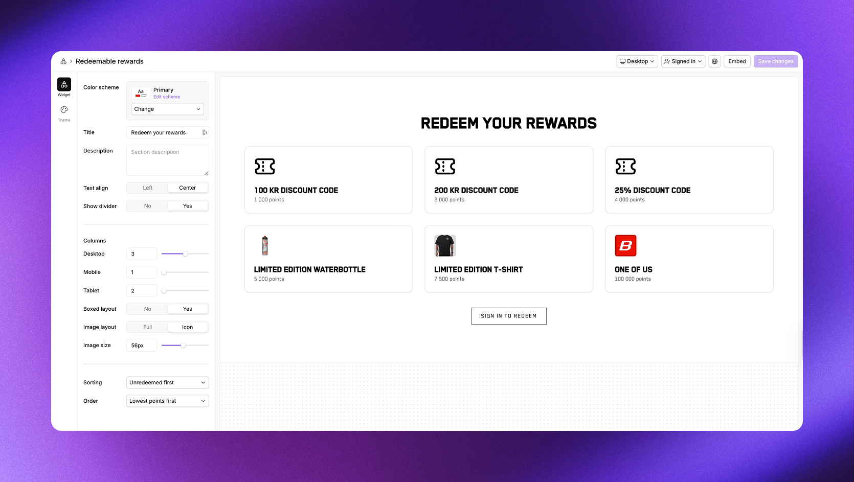
Example from our demo store. Customize the look in your design theme.
Tier cards
The Tier cards section displays all your program tiers in a card layout. Each card shows the tier name, icon, required points, entry rewards, and perks. Visitors can see exactly what benefits they’ll unlock at each level. This section works well on your landing page to showcase the value of progressing through your program. When a member is logged in, their current tier is highlighted so they can easily see where they are and what’s next.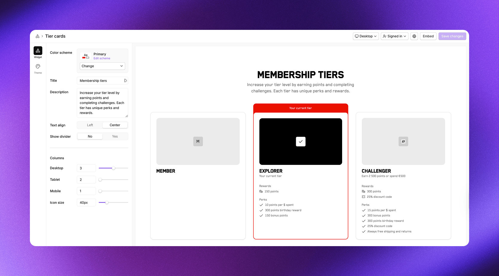
Example from our demo store. Customize the look in your design theme.
FAQ
The FAQ section lets you answer common questions about your program. Add questions and answers to help visitors and members understand how earning, redeeming, tiers, and other aspects of your program work. A well-crafted FAQ reduces support questions and helps visitors feel confident about joining. You can add as many questions as needed and reorder them by dragging.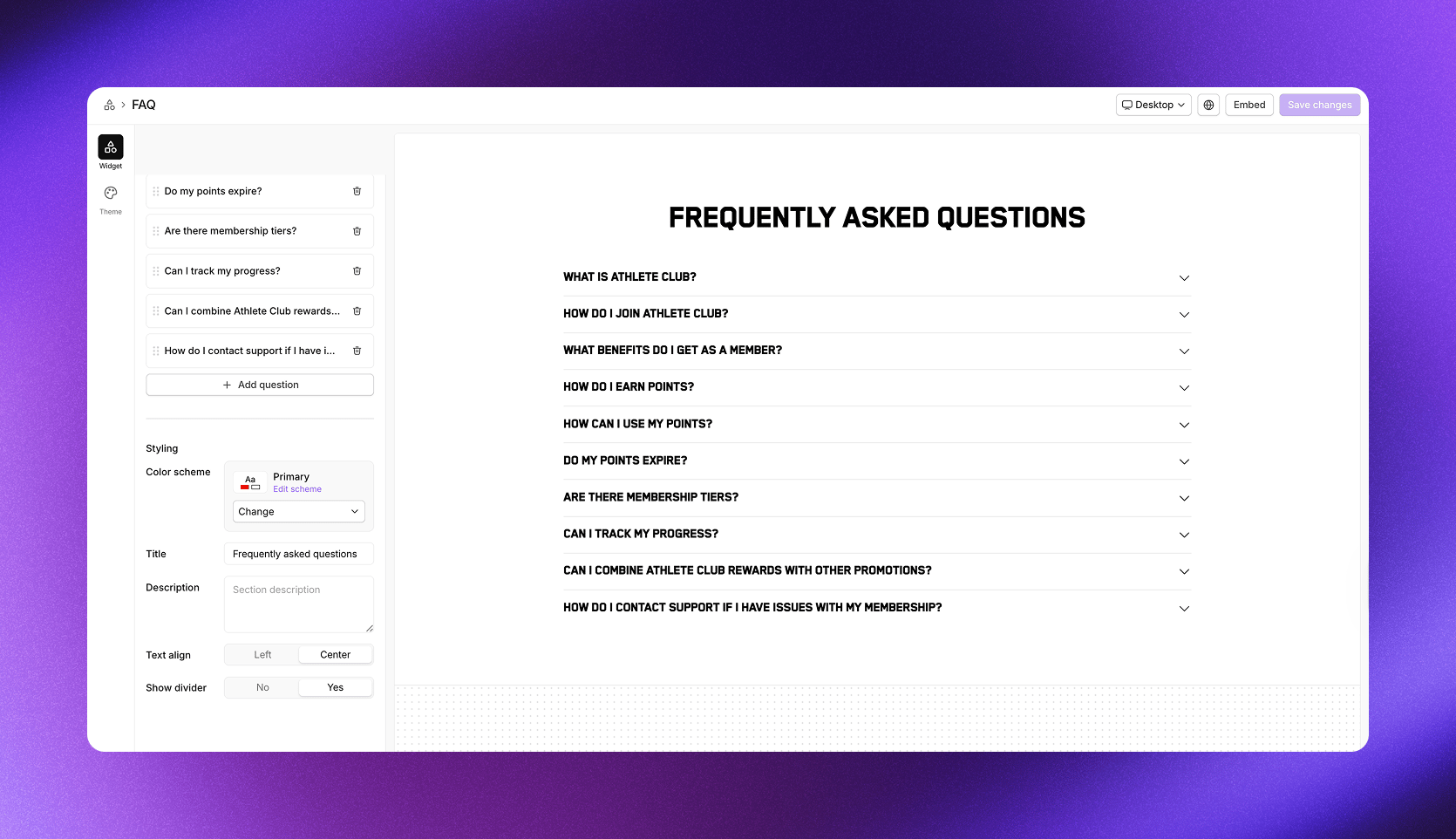
Example from our demo store. Customize the look in your design theme.
Full landing page
The Full landing page widget combines multiple sections into a single embeddable widget, giving you a complete rewards program page with one embed code. It’s the fastest way to launch your program’s online presence. Navigate to Rewards program -> On-site widgets and select Full landing page.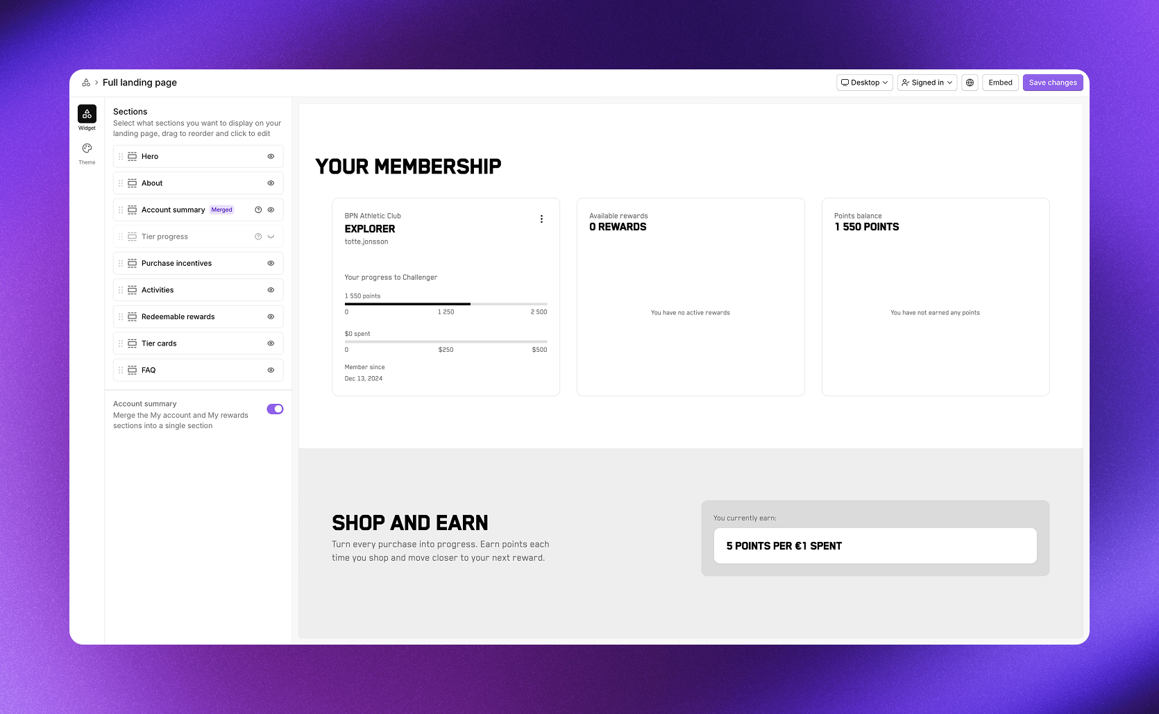
Example from our demo store. Customize the look in your design theme.
Managing sections
Under Sections, you can:- Toggle visibility using the eye icon next to each section
- Reorder sections by dragging them up or down
- Edit settings by clicking on a section name
Account summary toggle
At the bottom of the section list, the Account summary toggle changes how member information is displayed:- On: Merges My account and My rewards into a single Account summary section with three summary cards
- Off: Shows My account and My rewards as separate sections
Preview options
Toggle between Logged out and Signed in in the preview to see how the page looks for visitors versus members. Switch between Desktop, Tablet, and Mobile to check the responsive layout.Embedding widgets
Click Embed in the top right corner of any widget editor to see your embedding options and follow the embed instructions.Shopify
If you’re using Shopify, our prebuilt blocks are the easiest way to add widgets to your store. Through the Cevoid Shopify app, you can add widget sections directly in the Shopify theme editor without writing any code.- Open the Shopify theme editor
- Click Add section or Add block
- Select the Cevoid widget you want to add
General implementation
For non-Shopify platforms or headless setups, embed widgets manually using code:- Add the Cevoid script to your site’s
<head>tag - Paste the widget code where you want the widget to appear