How cards work
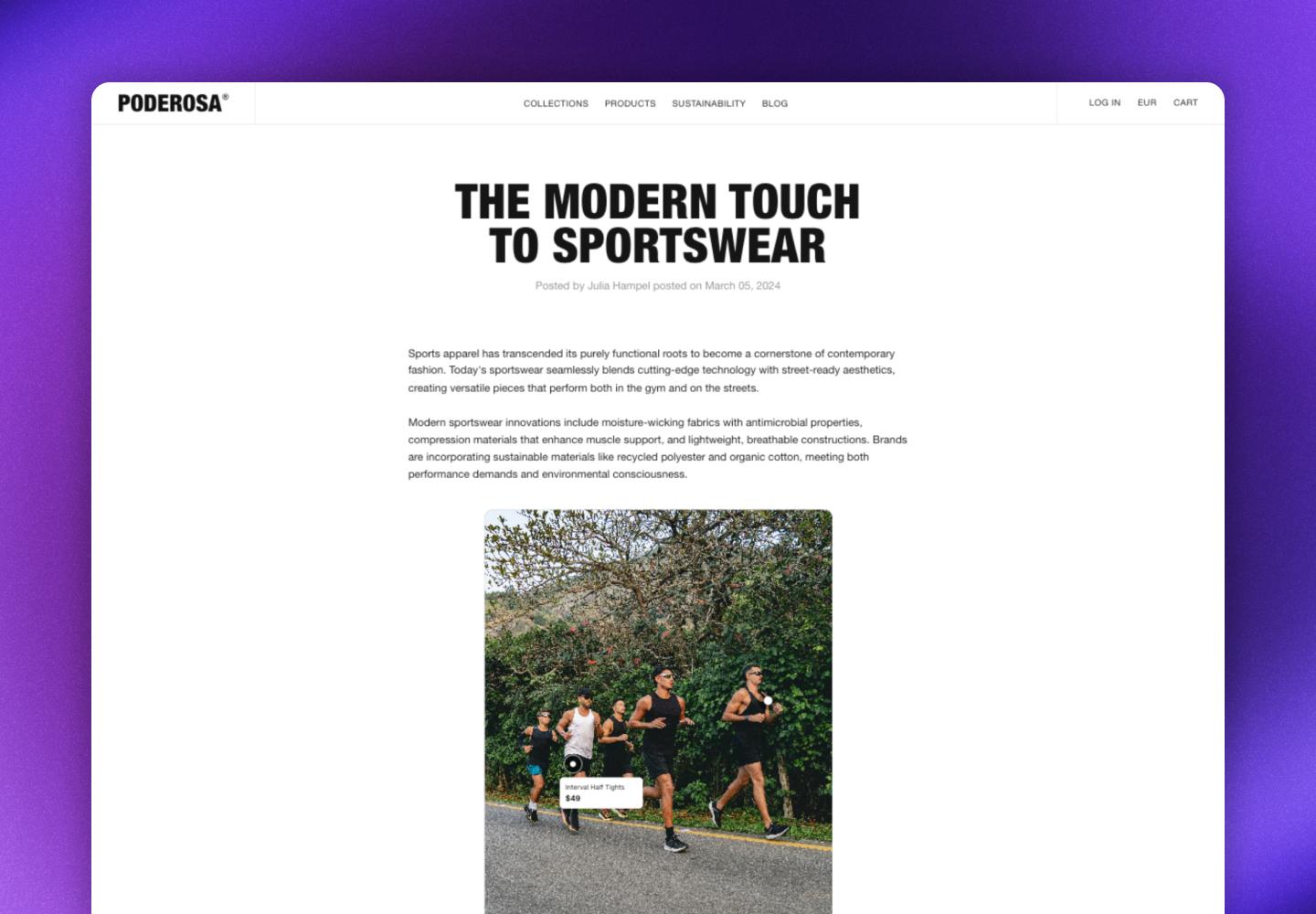
Cards display a single, specific post that you select. Unlike galleries, cards show static content and don’t update automatically. When visitors click on the card, a popup opens with the full post, creator information, caption, and shoppable product tags. Key features:- Static content: Cards display the exact post you select
- Photo or video: Display either images or videos
- Shoppable experience: Product tags link directly to your product pages
- Customizable design: Adjust the look for each card
- Localized: Adjusts language, links, currency, and prices based on the market
- Responsive design: Adapts to different screen sizes and devices
Create a card
- Navigate to UGC -> On-site widgets
- Click New widget
- Select Card
- Click the Content tab
- Choose the post you want to display
- Optional: Click More and rename your card
- Click Save changes
Design and customize cards
Each card can be customized to fit the page it’s embedded on.Styling changes apply on the next page view after clicking Save changes.
- Navigate to UGC -> On-site widgets
- Select your card
- Click the Design tab
- Apply your changes
- Click Save changes
Card size
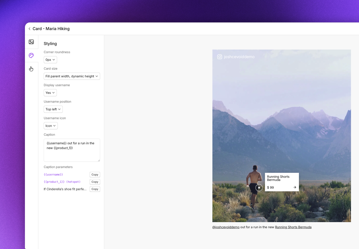
Control how the card fills its container.Corner roundness
Adjust the corner radius in pixels to match your site’s design.Username display
Show the creator’s username on the card for social proof.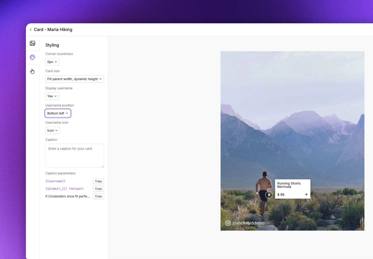
Caption
Add text below the card. You can include dynamic values:- Username: The creator’s username
- Product: Names of tagged products with clickable links
- Original caption: The post’s original caption
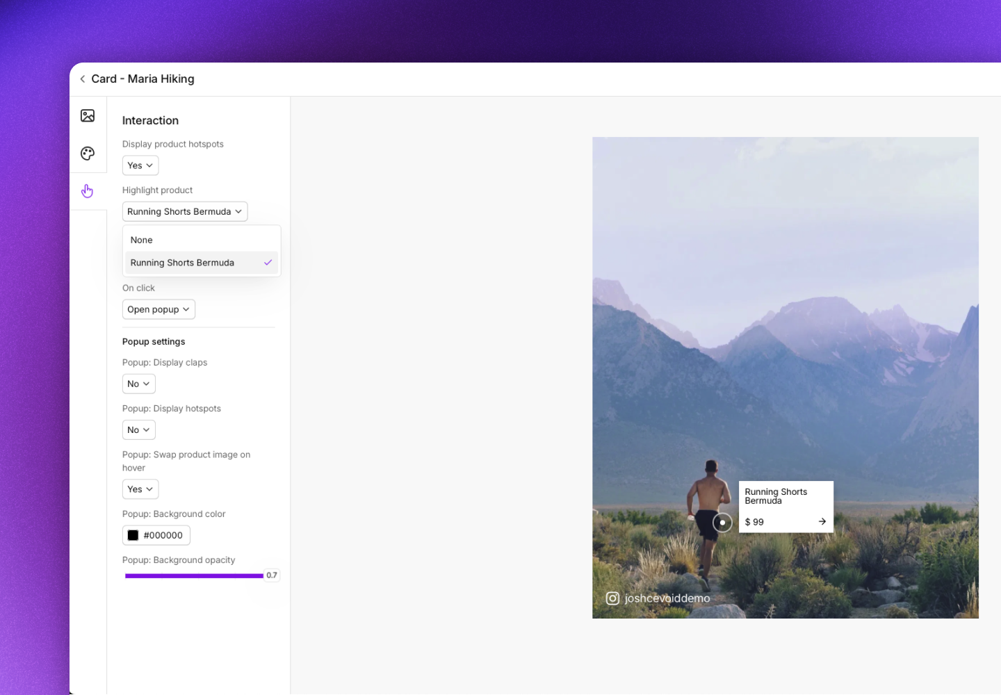
Product hotspots
Hotspots highlight tagged products on the image. The product name and price display when visitors hover over each hotspot.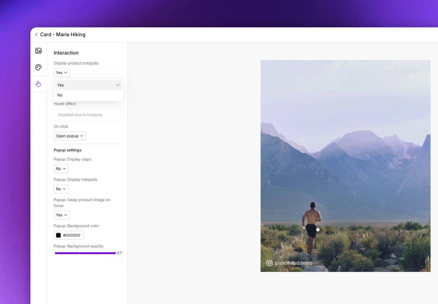
When you highlight a product, its name and price are always visible without requiring visitors to hover.
Hover effect
Add a hover effect when visitors mouse over the card. Only available when hotspots are disabled.Click behavior
Control what happens when visitors click the card.Popup settings
Customize how the popup appears when visitors click the card. See UGC popup for all popup settings.Change the post in a card
Cards display static content, but you can change which post is shown at any time.- Navigate to UGC -> On-site widgets and select the card
- Click the Content tab
- Select a new post
- Click Save changes
Unlike galleries, cards don’t automatically update. You must manually change the post when you want to display different content.
Embed cards on your website
- General implementation
- CMS block
Embed cards on any HTML-based website using Cevoid’s script and a div element.
-
Add Cevoid’s script to your website’s
<head>or<footer>(you only need to do this once): - Navigate to UGC -> On-site widgets and select your card
- Click Embed card
- Copy the div code
- Paste where you want the card on your website
- Save and publish your changes