The widget design theme currently works with all Program widgets. We are working on expanding this to other widgets soon!
Import design from a website
- Import from URL
- Import from current Shopify theme
Cevoid AI (cAI), will scan your website’s code and take a screenshot of your website. The information fetched is then used to apply matching theme settings, fonts, and color schemes.
- Navigate to Settings -> Theme
- Click Import
- Click Import from website
- Enter a public URL from where you want cAI to import from
- Click Import
Fonts
Cevoid already provide popular fonts, including Google Fonts, the theme editor. If you need to use a font that is not listed, you can upload a custom font below.- Navigate to Settings -> Theme
- Click Upload font
- Select your font files
Theme variables
The theme variables allow you to adjust the look of all Program widgets and sections at the same time. This way, you can ensure on-brand widgets easily and adjust them on a granular level.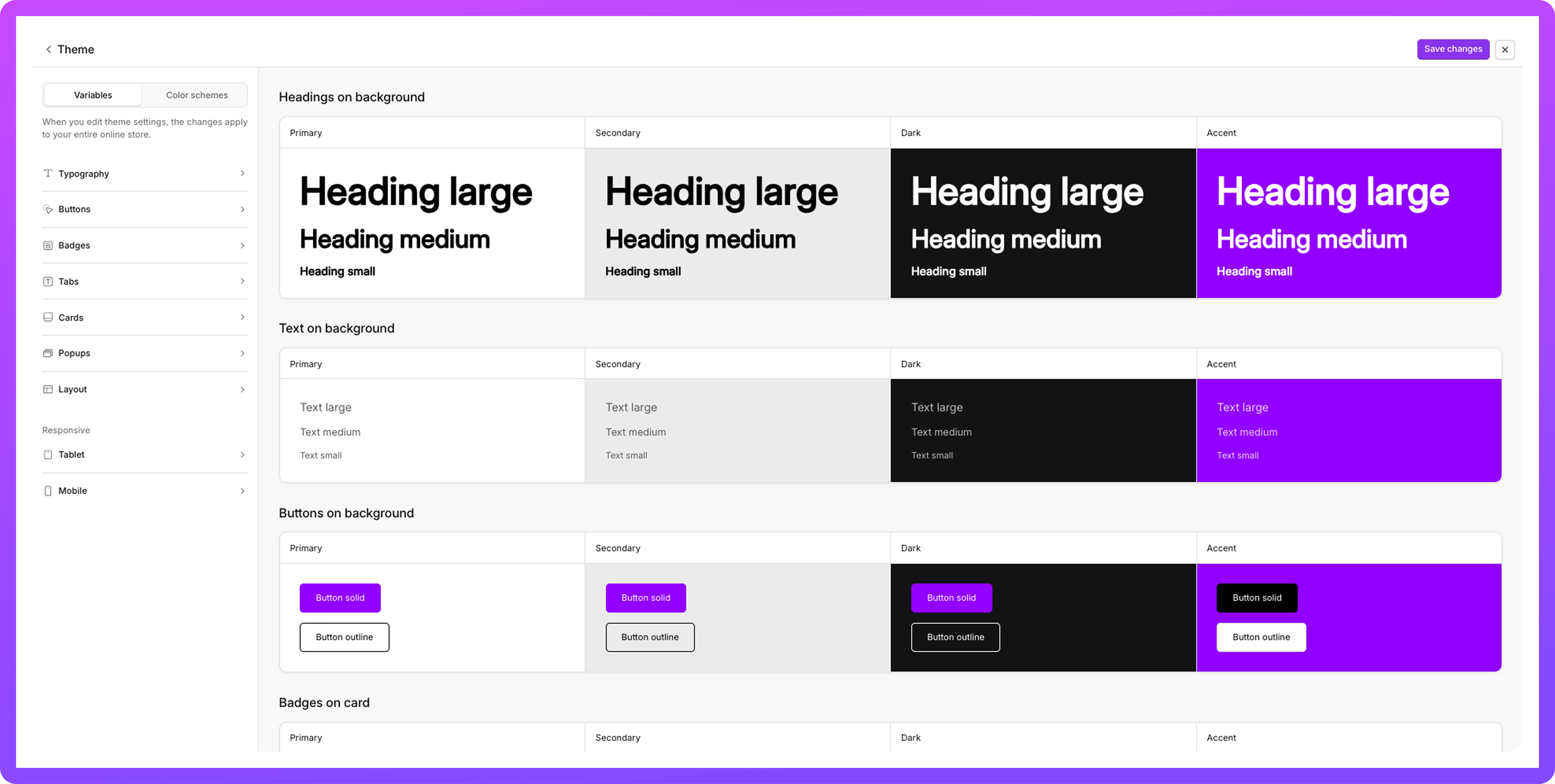
Navigate to Settings -> Theme
- Click Customize
- Click Variables
- Apply your changes
- Click Save changes
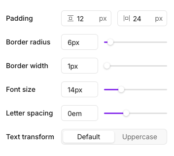
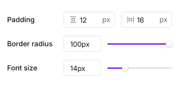
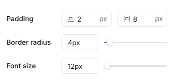
Available settings for theme variables
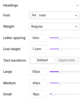
Typography - Headings
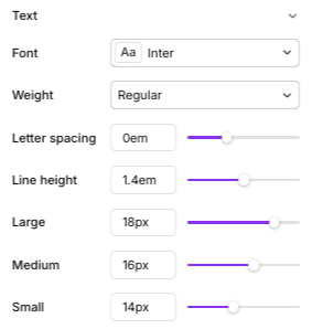
Typography - Text
Buttons
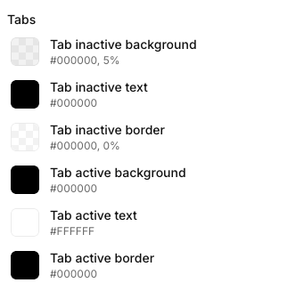
Tabs
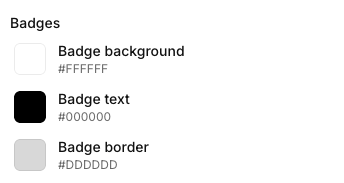
Badges
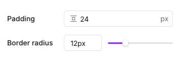
Cards
Popup
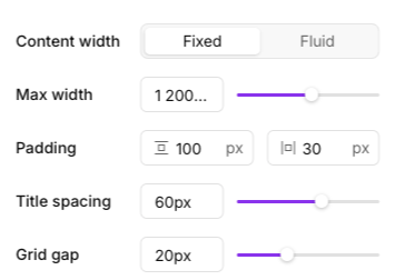
Layout
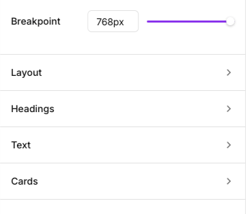
Mobile and Tablets
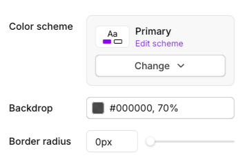
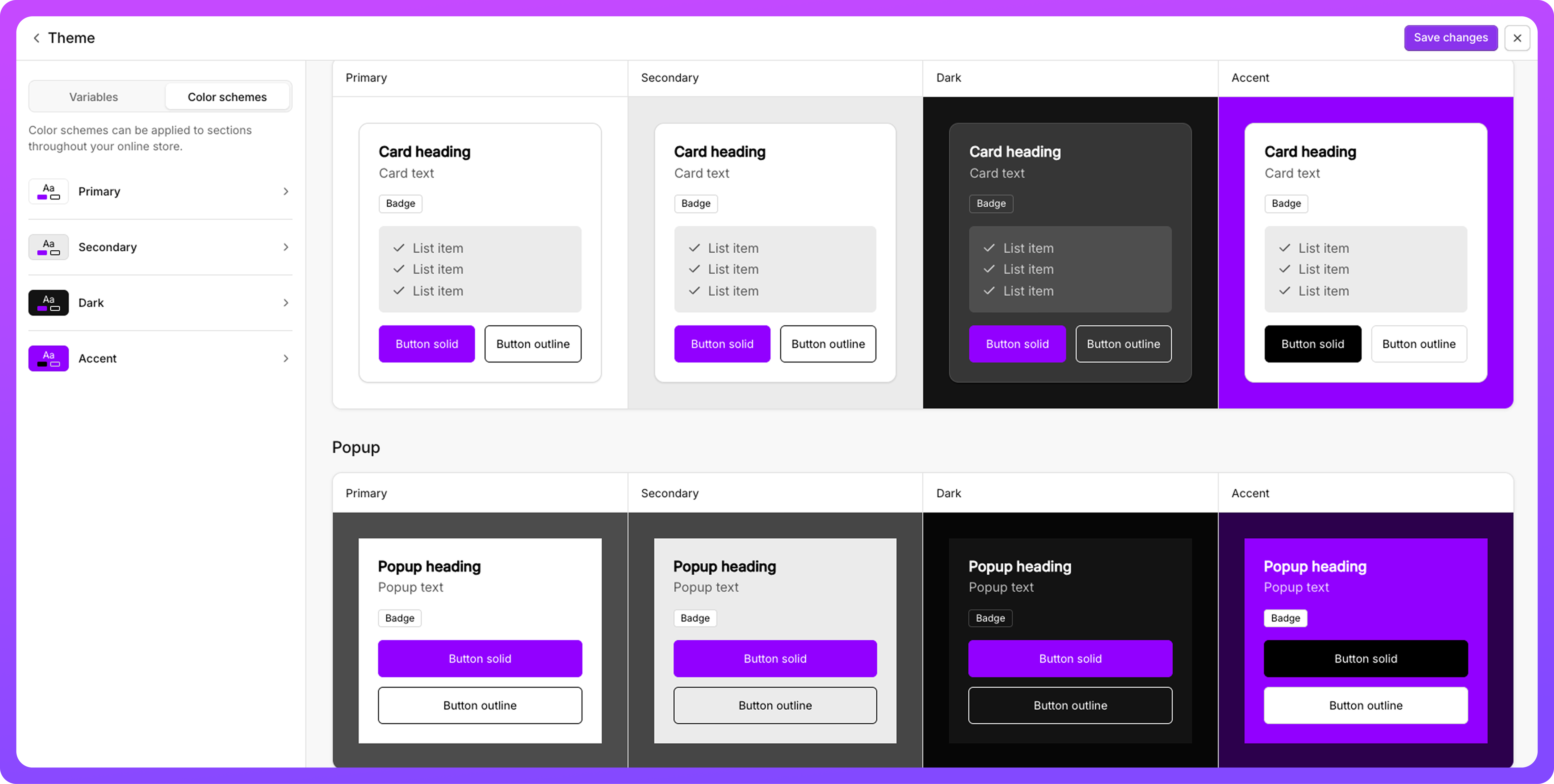
Color schemes
Each Program widget and section can be styled separately with one of the active color schemes.This opens up for a more visual experience. The color schemes can be customized within the Design Theme.
Navigate to Settings -> Theme
- Click Customize
- Click Color Schemes
- Apply your changes
- Click Save changes
Available settings for color schemes
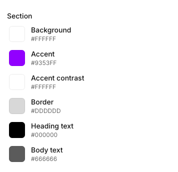
Sections
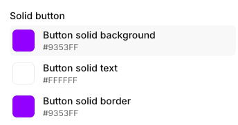
Solid button
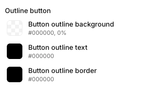
Outline button
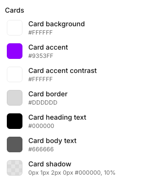
Cards
Tabs