> ## Documentation Index
> Fetch the complete documentation index at: https://docs.cevoid.com/llms.txt
> Use this file to discover all available pages before exploring further.
# Design theme
> Control the look and feel of all your rewards program widgets from one place.
Related articles:
[On-site widgets](/program/on-site-widgets), [Translations](/general/translations)
The design theme controls fonts, colors, and layout for all your rewards program widgets. Instead of styling each widget individually, you set your brand's visual identity once and it applies everywhere.
Navigate to [Settings -> Theme](https://app.cevoid.com/settings/theme) to manage your design theme.
The theme settings are currently only available for rewards program widgets.
***
## Importing a theme
The fastest way to set up your design theme is to import it from your existing website. Cevoid's AI will analyze your site and apply matching fonts, colors, and styling automatically.
Click **Import** and choose one of two options:
### Import from Shopify
If you're using Shopify, this is the recommended option. Cevoid reads your Shopify theme files directly to extract fonts and color settings.
1. Click **Import** -> **Import from Shopify**
2. Click **Import** to confirm
### Import from website
For non-Shopify stores or if you want to import from a specific URL, use this option. Cevoid's AI scans your website's code and takes a screenshot to extract design settings.
1. Click **Import** -> **Import from website**
2. Enter the URL you want to import from
3. Click **Import** to confirm
Importing a theme will overwrite your current theme settings. You'll be asked to confirm before proceeding.
***
## Customizing your theme
Click **Customize** to open the theme editor. The editor has two tabs: **Variables** and **Color schemes**.
The editor shows a live preview of your changes as you make them. Switch between desktop, tablet, and mobile views to check how your theme looks across devices.
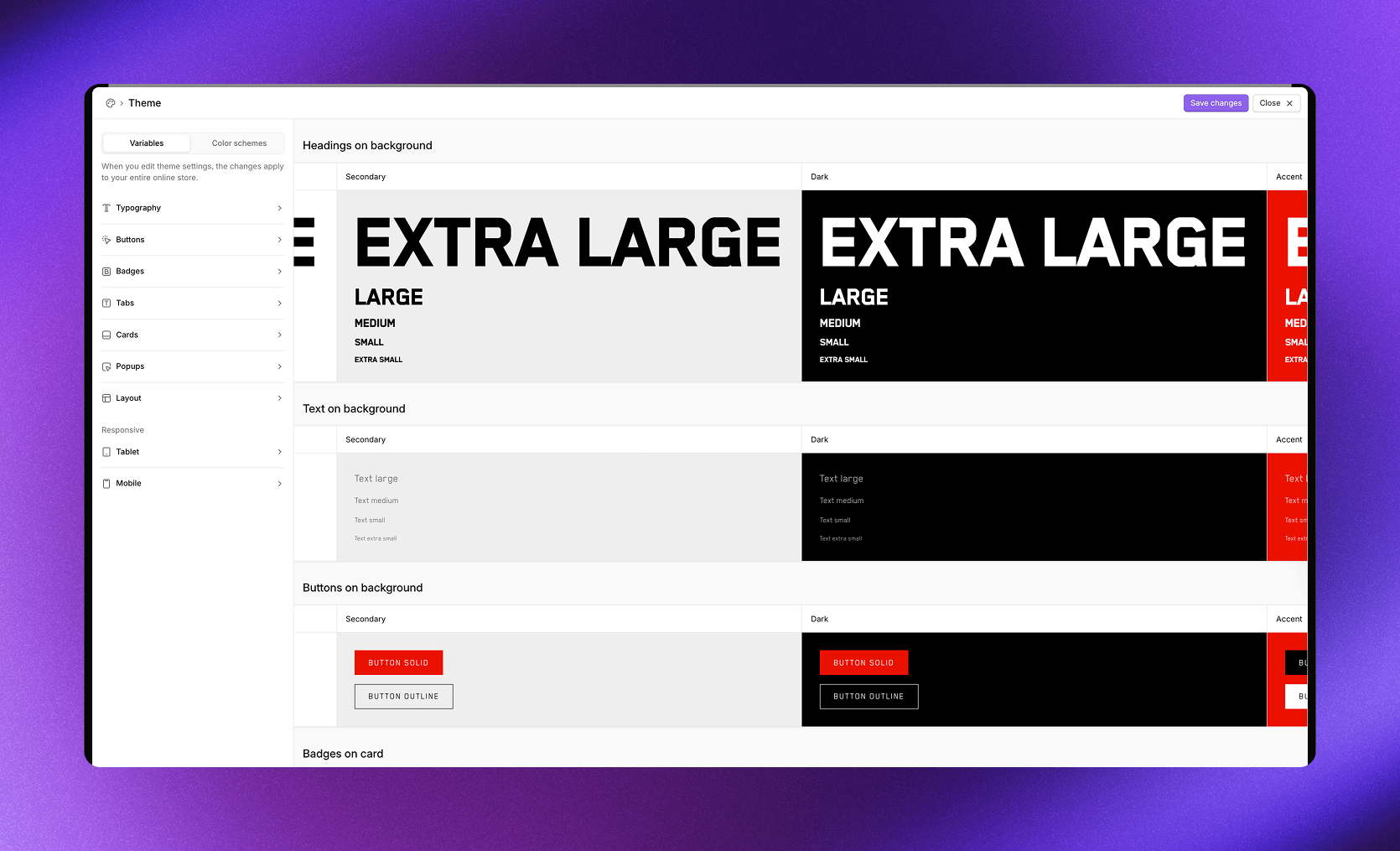 ***
## Variables
Variables control typography, layout, and responsive behavior across all widgets.
### Typography
Set fonts and text styling for your widgets.
**Headings**
| Setting | Description |
| ------------------ | -------------------------------------------------------- |
| **Font** | Select from custom fonts, web fonts, or upload a new one |
| **Weight** | Font weight (Regular, Bold, etc.) |
| **Letter spacing** | Space between letters |
| **Line height** | Space between lines |
| **Text transform** | Default or Uppercase |
| **Extra large** | Size in pixels for extra large headings |
| **Large** | Size in pixels for large headings |
| **Medium** | Size in pixels for medium headings |
| **Small** | Size in pixels for small headings |
| **Extra small** | Size in pixels for extra small headings |
**Text**
| Setting | Description |
| ------------------ | -------------------------------------------------------- |
| **Font** | Select from custom fonts, web fonts, or upload a new one |
| **Weight** | Font weight |
| **Letter spacing** | Space between letters |
| **Line height** | Space between lines |
| **Large** | Size in pixels for large text |
| **Medium** | Size in pixels for medium text |
| **Small** | Size in pixels for small text |
| **Extra small** | Size in pixels for extra small text |
***
### Popups
Control the appearance of popup dialogs.
| Setting | Description |
| ----------------- | ------------------------------------ |
| **Color scheme** | Which color scheme to use for popups |
| **Backdrop** | Background overlay color and opacity |
| **Border radius** | Corner roundness in pixels |
***
### Layout
Set spacing and width for your widgets.
| Setting | Description |
| ----------------- | ---------------------------------------------- |
| **Content width** | Fixed (with max width) or Fluid (full width) |
| **Max width** | Maximum width in pixels when using Fixed |
| **Padding** | Vertical and horizontal spacing around content |
| **Title spacing** | Space below section titles |
| **Grid gap** | Space between grid items |
***
### Tablet
| Setting | Description |
| -------------- | -------------------------------------- |
| **Breakpoint** | Screen width where tablet styles apply |
***
### Mobile
Adjust layout and sizing for mobile screens.
| Setting | Description |
| -------------- | -------------------------------------- |
| **Breakpoint** | Screen width where mobile styles apply |
**Layout**
| Setting | Description |
| ----------------- | ----------------------------------------- |
| **Padding** | Vertical and horizontal spacing on mobile |
| **Title spacing** | Space below section titles on mobile |
| **Grid gap** | Space between grid items on mobile |
**Headings**
Override heading sizes for mobile screens.
| Setting | Description |
| --------------- | -------------- |
| **Extra large** | Size in pixels |
| **Large** | Size in pixels |
| **Medium** | Size in pixels |
| **Small** | Size in pixels |
| **Extra small** | Size in pixels |
**Text**
Override text sizes for mobile screens.
| Setting | Description |
| --------------- | -------------- |
| **Large** | Size in pixels |
| **Medium** | Size in pixels |
| **Small** | Size in pixels |
| **Extra small** | Size in pixels |
**Cards**
| Setting | Description |
| ----------- | ---------------------- |
| **Padding** | Card padding on mobile |
***
## Color schemes
Color schemes let you create different color palettes that can be applied to individual widget sections. This allows for visual variety while maintaining brand consistency.
The editor shows four default schemes: **Primary**, **Secondary**, **Dark**, and **Accent**. Click any scheme in the sidebar to edit its colors.
The preview area shows how each scheme looks on different elements: tabs, cards, and popups.
### Editing a color scheme
Each color scheme contains settings for sections, buttons, tabs, and cards.
**Section**
| Setting | Description |
| ------------------- | -------------------------------- |
| **Background** | Section background color |
| **Accent** | Accent color for highlights |
| **Accent contrast** | Text color on accent backgrounds |
| **Border** | Border color |
| **Heading text** | Heading text color |
| **Body text** | Body text color |
**Solid button**
| Setting | Description |
| --------------------------- | ---------------- |
| **Button solid background** | Background color |
| **Button solid text** | Text color |
| **Button solid border** | Border color |
**Outline button**
| Setting | Description |
| ----------------------------- | ------------------------------- |
| **Button outline background** | Background color (with opacity) |
| **Button outline text** | Text color |
| **Button outline border** | Border color |
**Tabs**
| Setting | Description |
| --------------------------- | ---------------------------- |
| **Tab inactive background** | Background for inactive tabs |
| **Tab inactive text** | Text color for inactive tabs |
| **Tab inactive border** | Border for inactive tabs |
| **Tab active background** | Background for active tabs |
| **Tab active text** | Text color for active tabs |
| **Tab active border** | Border for active tabs |
**Cards**
| Setting | Description |
| ------------------------ | ---------------------------------------------- |
| **Card background** | Card background color |
| **Card accent** | Accent color within cards |
| **Card accent contrast** | Text on card accent backgrounds |
| **Card border** | Card border color |
| **Card heading text** | Card heading color |
| **Card body text** | Card body text color |
| **Card shadow** | Shadow settings (offset, blur, color, opacity) |
### Using color schemes
When editing any widget section, you can select which color scheme to apply from the **Color scheme** dropdown. This lets you create visual contrast between sections on the same page.
***
## Custom fonts
If your brand uses a font that isn't available in the theme editor, you can upload custom fonts.
Navigate to [Settings -> Theme](https://app.cevoid.com/settings/theme) and scroll to the **Custom fonts** section.
1. Click **Upload font**
2. Select your font file
Supported formats: .otf, .ttf, .woff, .woff2
Once uploaded, your custom font appears in the font dropdown when editing Typography settings.
Popular fonts, including Google Fonts, are already available in the theme editor. Only upload custom fonts if you need one that isn't listed.
***
## Variables
Variables control typography, layout, and responsive behavior across all widgets.
### Typography
Set fonts and text styling for your widgets.
**Headings**
| Setting | Description |
| ------------------ | -------------------------------------------------------- |
| **Font** | Select from custom fonts, web fonts, or upload a new one |
| **Weight** | Font weight (Regular, Bold, etc.) |
| **Letter spacing** | Space between letters |
| **Line height** | Space between lines |
| **Text transform** | Default or Uppercase |
| **Extra large** | Size in pixels for extra large headings |
| **Large** | Size in pixels for large headings |
| **Medium** | Size in pixels for medium headings |
| **Small** | Size in pixels for small headings |
| **Extra small** | Size in pixels for extra small headings |
**Text**
| Setting | Description |
| ------------------ | -------------------------------------------------------- |
| **Font** | Select from custom fonts, web fonts, or upload a new one |
| **Weight** | Font weight |
| **Letter spacing** | Space between letters |
| **Line height** | Space between lines |
| **Large** | Size in pixels for large text |
| **Medium** | Size in pixels for medium text |
| **Small** | Size in pixels for small text |
| **Extra small** | Size in pixels for extra small text |
***
### Popups
Control the appearance of popup dialogs.
| Setting | Description |
| ----------------- | ------------------------------------ |
| **Color scheme** | Which color scheme to use for popups |
| **Backdrop** | Background overlay color and opacity |
| **Border radius** | Corner roundness in pixels |
***
### Layout
Set spacing and width for your widgets.
| Setting | Description |
| ----------------- | ---------------------------------------------- |
| **Content width** | Fixed (with max width) or Fluid (full width) |
| **Max width** | Maximum width in pixels when using Fixed |
| **Padding** | Vertical and horizontal spacing around content |
| **Title spacing** | Space below section titles |
| **Grid gap** | Space between grid items |
***
### Tablet
| Setting | Description |
| -------------- | -------------------------------------- |
| **Breakpoint** | Screen width where tablet styles apply |
***
### Mobile
Adjust layout and sizing for mobile screens.
| Setting | Description |
| -------------- | -------------------------------------- |
| **Breakpoint** | Screen width where mobile styles apply |
**Layout**
| Setting | Description |
| ----------------- | ----------------------------------------- |
| **Padding** | Vertical and horizontal spacing on mobile |
| **Title spacing** | Space below section titles on mobile |
| **Grid gap** | Space between grid items on mobile |
**Headings**
Override heading sizes for mobile screens.
| Setting | Description |
| --------------- | -------------- |
| **Extra large** | Size in pixels |
| **Large** | Size in pixels |
| **Medium** | Size in pixels |
| **Small** | Size in pixels |
| **Extra small** | Size in pixels |
**Text**
Override text sizes for mobile screens.
| Setting | Description |
| --------------- | -------------- |
| **Large** | Size in pixels |
| **Medium** | Size in pixels |
| **Small** | Size in pixels |
| **Extra small** | Size in pixels |
**Cards**
| Setting | Description |
| ----------- | ---------------------- |
| **Padding** | Card padding on mobile |
***
## Color schemes
Color schemes let you create different color palettes that can be applied to individual widget sections. This allows for visual variety while maintaining brand consistency.
The editor shows four default schemes: **Primary**, **Secondary**, **Dark**, and **Accent**. Click any scheme in the sidebar to edit its colors.
The preview area shows how each scheme looks on different elements: tabs, cards, and popups.
### Editing a color scheme
Each color scheme contains settings for sections, buttons, tabs, and cards.
**Section**
| Setting | Description |
| ------------------- | -------------------------------- |
| **Background** | Section background color |
| **Accent** | Accent color for highlights |
| **Accent contrast** | Text color on accent backgrounds |
| **Border** | Border color |
| **Heading text** | Heading text color |
| **Body text** | Body text color |
**Solid button**
| Setting | Description |
| --------------------------- | ---------------- |
| **Button solid background** | Background color |
| **Button solid text** | Text color |
| **Button solid border** | Border color |
**Outline button**
| Setting | Description |
| ----------------------------- | ------------------------------- |
| **Button outline background** | Background color (with opacity) |
| **Button outline text** | Text color |
| **Button outline border** | Border color |
**Tabs**
| Setting | Description |
| --------------------------- | ---------------------------- |
| **Tab inactive background** | Background for inactive tabs |
| **Tab inactive text** | Text color for inactive tabs |
| **Tab inactive border** | Border for inactive tabs |
| **Tab active background** | Background for active tabs |
| **Tab active text** | Text color for active tabs |
| **Tab active border** | Border for active tabs |
**Cards**
| Setting | Description |
| ------------------------ | ---------------------------------------------- |
| **Card background** | Card background color |
| **Card accent** | Accent color within cards |
| **Card accent contrast** | Text on card accent backgrounds |
| **Card border** | Card border color |
| **Card heading text** | Card heading color |
| **Card body text** | Card body text color |
| **Card shadow** | Shadow settings (offset, blur, color, opacity) |
### Using color schemes
When editing any widget section, you can select which color scheme to apply from the **Color scheme** dropdown. This lets you create visual contrast between sections on the same page.
***
## Custom fonts
If your brand uses a font that isn't available in the theme editor, you can upload custom fonts.
Navigate to [Settings -> Theme](https://app.cevoid.com/settings/theme) and scroll to the **Custom fonts** section.
1. Click **Upload font**
2. Select your font file
Supported formats: .otf, .ttf, .woff, .woff2
Once uploaded, your custom font appears in the font dropdown when editing Typography settings.
Popular fonts, including Google Fonts, are already available in the theme editor. Only upload custom fonts if you need one that isn't listed.